
For most of AI image generation’s short history, text has been its weakest spot. Ask an early diffusion model for a coffee shop sign that says “Morning Brew Co.” and you’d typically get something that looked like a sign, with letters that vaguely resembled English but spelled nothing at all. That’s changed dramatically over the last year, and it’s changed enough that “which AI tool can actually render text correctly” is now one of the most common questions we get from readers building logos, posters, packaging mockups, and ad creative. This report is our hands-on look at the tools that handle typography best in 2026, and just as importantly, the ones that still struggle.
Why Text Rendering Is Hard for Diffusion Models
Most image generators, even very good ones, work by gradually denoising a field of random pixels into a coherent picture, guided by a text encoder that translates your prompt into a direction for that process to follow. That architecture is excellent at learning “what things generally look like,” but letterforms are unforgiving in a way that clouds, faces, and landscapes are not — a face can be slightly asymmetrical and still read as a face, but a logo with one wrong letter is simply wrong. Newer transformer-based models that generate images more like language models generate text — token by token rather than through pure noise-refinement — tend to hold up better here, which is a big part of why the leaderboard for typography-specific tasks looks different from the leaderboard for general photorealism.
Ideogram 3.0: The Typography Specialist
Ideogram has built its entire reputation around one thing: getting text right. Across our testing and in line with broader industry consensus, Ideogram 3.0 remains the strongest model specifically for rendering fonts, logo lettering, and stylized typography accurately — it handles multi-word phrases, varied font weights, and curved or stylized text placement (like text wrapped around a badge or arced across a poster) more reliably than general-purpose competitors. For anyone whose output needs to include an actual legible brand name, tagline, or call-to-action baked directly into the image, this is currently the tool we point people toward first.
Where Ideogram is less competitive is raw photorealism — it’s not the model you’d reach for to generate a lifelike portrait or a product photo indistinguishable from a real camera shot. It’s a specialist, and like most specialists, it trades some general-purpose polish for depth in its core skill.
FLUX.2 Kontext: Built for Consistent Production Work
Black Forest Labs’ FLUX.2 Kontext line is designed less around one-off image generation and more around production workflows where the same character, product, or brand style needs to persist across dozens of assets. That matters enormously for poster and campaign work specifically because a marketing campaign is rarely one image — it’s a logo treatment repeated across a poster, a social banner, a business card, and packaging, all of which need to feel like they came from the same designer. Flux.2 Kontext is available across a range of tiers ([dev], [pro], and [max]), including open-weight versions that technical teams can self-host, which makes it a popular choice for agencies that want typography and character consistency without being locked into a single vendor’s hosted platform.
How Midjourney and Other Generalists Compare
It’s worth being direct about this: Midjourney, despite being many designers’ favorite tool for mood and atmosphere, has historically been one of the weaker options specifically for in-image text, and while recent versions have improved, it’s still not the first tool we’d reach for when the brief requires precise, legible typography. The practical workaround many designers use is a hybrid workflow — generate the visual backdrop or texture in Midjourney for its distinctive aesthetic, then add the actual typography as a separate layer in Photoshop or Illustrator, rather than asking the AI model to render the text natively. It’s a reasonable compromise, but it does mean an extra production step that Ideogram or Flux.2 users can often skip.
What We Tested and What to Look For
When evaluating a tool for typography-heavy work, we look at four things specifically, and we’d suggest you do the same before committing to a subscription for this use case:
- Letter accuracy on short phrases — single words and short taglines (under five words) are the baseline test; a tool that fails here isn’t ready for logo work.
- Accuracy on longer phrases — full sentences, like a poster’s supporting copy, are meaningfully harder and separate the genuine typography specialists from tools that just got lucky on a short prompt.
- Font style control — can you request a specific typographic feel (bold sans-serif, hand-lettered script, art deco) and get something recognizably in that family, not just “a font”?
- Placement and composition control — does the model respect layout instructions like “text along the top third” or “logo centered with tagline below,” or does it improvise the layout regardless of what you asked for?
Comparison Table
| Tool | Text Accuracy | Best For | Weaker At |
|---|---|---|---|
| Ideogram 3.0 | Excellent | Logos, posters, ad copy baked into the image | Photorealistic portraits and product shots |
| FLUX.2 Kontext | Strong | Multi-asset campaigns needing consistent branding | Requires more setup for self-hosted tiers |
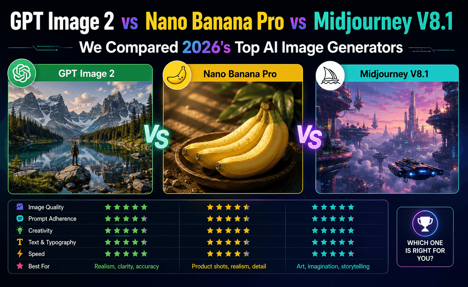
| Nano Banana Pro | Strong (short phrases, diagrams) | Infographics with accurate labels | Long, stylized poster copy |
| Midjourney V8.1 | Improving, still inconsistent | Atmosphere and mood over precise text | Multi-word taglines and small print |
Practical Prompting Tips for Better Text Results
Regardless of which tool you use, a few habits noticeably improve text accuracy across the board in our testing. Put the exact text you want in quotation marks within your prompt rather than describing it indirectly. Keep the requested text as short as the design allows — every additional word compounds the chance of an error. Specify the font category in plain language (“bold condensed sans-serif,” “elegant serif”) rather than naming a specific commercial typeface, since most models weren’t trained with reliable knowledge of exact licensed font names. And when a generation gets 90% of the way there with one wrong letter, it’s usually faster to fix that letter in an image editor than to keep re-rolling the entire generation hoping for a perfect result.
A Simple Workflow for Small Business Owners
Most of the people asking us about typography-focused AI tools aren’t professional designers — they’re small business owners trying to make a poster, a menu board, or a social media graphic without hiring an agency. If that’s you, a workflow that has worked well in our own testing looks roughly like this: start with Ideogram for the core layout, including your business name and any short tagline, and generate several variations rather than settling on the first result. Pick the version with the cleanest text and the composition you like best, even if a color or background detail isn’t perfect — those are easy to adjust afterward. Then, if you need the exact same branding applied to multiple formats (an Instagram post, a printed flyer, a business card), consider a tool built for consistency, like FLUX.2 Kontext, rather than trying to regenerate the same result from scratch in each new aspect ratio, since re-prompting tends to introduce small inconsistencies in color and style between assets.
Finally, budget for a short manual cleanup pass in any basic photo editor before you publish or print. Fixing a slightly misaligned letter or adjusting contrast takes a few minutes and consistently produces a more professional final result than accepting the raw AI output as-is.
Frequently Asked Questions
Can any AI tool guarantee perfect spelling every time?
No, and be skeptical of any provider that claims otherwise. Even the strongest typography-focused models occasionally misspell longer phrases or unusual words. Budget time for a few regenerations, and always proofread final output before it goes to print or publication — this is the single most common mistake we see teams make when adopting AI-generated marketing assets.
Is Ideogram good for anything besides text-heavy images?
Yes, it handles general illustration and graphic design work reasonably well, but its comparative advantage over other tools is specifically in typography. If your project is mostly photorealistic with a small amount of text, a model like GPT Image 2 or Nano Banana Pro combined with a manual text overlay may serve you better.
Do I need design software experience to use these tools well?
Not to get a usable first draft, but for final production assets — press-ready posters, packaging files — expect to still open the result in a proper design tool for color correction, bleed and trim setup, and any last-mile text fixes. AI image generators are extremely good first-draft and even second-draft tools, but “print-ready” is a higher bar that usually still benefits from a human pass.
Bottom Line
If your project lives or dies on legible, accurate typography — logos, posters, packaging, ad creative with copy baked in — Ideogram 3.0 is currently the strongest specialist tool in our testing, with FLUX.2 Kontext a strong second choice when brand consistency across many assets matters more than any single image. General-purpose favorites like Midjourney remain excellent for mood and atmosphere but are not yet the right tool when the text itself is the deliverable.


Leave a Reply